Interested in analyzing real-world examples of successful usability tests?
In this article, we’ll be examining six examples of usability testing being conducted with substantial results.
Conducting usability testing takes only seven simple steps and does not have to require a massive budget. Yet it can achieve remarkable results for companies across all industries.
If you’re someone who cannot be convinced by theory alone, this is the guide for you. These are tried-and-tested case studies from well-known companies that showcase the true power of a successful usability test.
Here are the usability testing examples and case studies we’ll be covering in this article:
Example #1: Ryanair
Ryanair is one of the world’s largest airline groups, carrying 152 million passengers each year. In 2014, the company launched Ryanair Labs, a digital innovation hub seeking to “reinvent online traveling”. To make this dream a reality, they went on a recruiting spree that resulted in a team of 200+ members. This team included user experience specialists, data analysts, software developers, and digital marketers – all working towards a common goal of improving the user experience of the Ryanair website.
What made matters more complicated, however, is that Ryanair’s website and app together received 1 billion visits per year. Working with a website this large, combined with the paper-thin profit margins of around 5% for the airline industry, Ryanair had no room for errors. To make matters even more stressful, one of the first missions for the new team included launching an entirely new website with a superior user experience.
To give you a visual idea of what they were up against, take a look at their old website design:
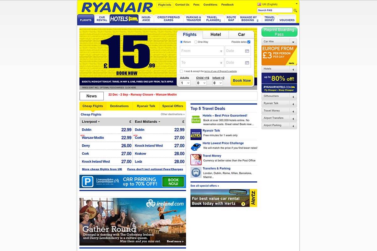
Not great, not terrible. But the website undoubtedly needed a redesign for the 21st century.
This is what the Ryanair team set out to accomplish:
- Reducing the number of steps needed to book a flight on the website;
- Allowing customers to store their travel documents and payment cards on the website;
- Delivering a better mobile device user experience for both the website and app.
With these goals in mind, they chose remote and unmoderated usability testing types for their user tests. This by itself was a change for the team, as the Ryanair team had relied on in-lab, face-to-face testing until that point.
By collaborating with the UX agency UserZoom, however, new opportunities opened up for Ryanair. With UzerZoom’s massive roster of user testers, Ryanair could access large amounts of qualitative and quantitative usability data. Data that they badly needed during the design process of the new website.
By going with remote unmoderated usability testing, the Ryanair team managed to:
- Reduce the time spent on usability testing;
- Conduct simultaneous usability tests with hundreds of users and without geographical barriers;
- Increase the overall reach and scale of the tests;
- Carry out tests across many devices, operating systems, and multiple focus groups.
With continuous user testing, the new website was taken through alpha and beta testing in 2015. The end result of all work this was the vastly improved look, functionality, and user experience of the new website:
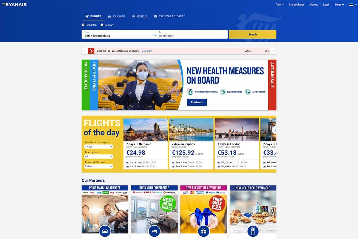
Even before launch, Ryanair knew that the new website was superior. Usability tests had shown that to be the case and they had no need to rely on “educated guesses”. This usability testing example demonstrates that a well-executed testing plan can give remarkable results.
Source: Ryanair case study by UserZoom
Example #2: McDonald’s
McDonald’s is one of the world’s largest fast-food restaurant chains, with a staggering 62 million daily customers. Yet, McDonald’s was late to embrace the mobile revolution as their smartphone app launched rather recently – in August 2015. In comparison, Starbucks’ smartphone app was already a booming success and accounted for 20% of its’ overall revenue in 2015.
Considering the competition, McDonald’s had some catching up to do. Before the launch of their app in the UK, they decided to hire UK-based SimpleUsability to identify any usability problems before release. The test plan involved conducting 20 usability tests, where the task scenarios covered the entire customer journey from end-to-end. In addition to that, the test plan included 225 end-user interviews.
Not exactly a large-scale usability study considering the massive size of McDonald’s, but it turned out to be valuable nonetheless. A number of usability issues were detected during the study:
- Poor visibility and interactivity of the call-to-action buttons;
- Communication problems between restaurants and the smartphone app;
- Lack of order customization and favoriting impaired the overall user experience.
Here’s what the McDonald’s mobile app looks like today:
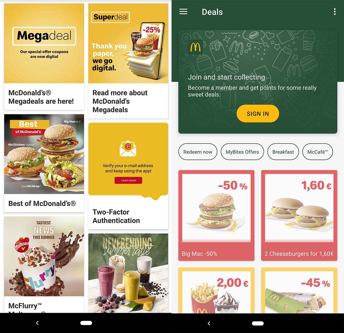
This case study demonstrates that investing even a tiny percentage of a company’s resources into usability testing can result in meaningful insights.
Source: McDonald’s case study by SimpleUsability
Example #3: SoundCloud
SoundCloud is the world’s largest music and audio distribution platform, with over 175 million unique monthly listeners. In 2019, SoundCloud hired test IO, a Berlin-based usability testing agency, to conduct continuous usability testing for the SoundCloud mobile app. With SoundCloud’s rigorous development schedule, the company needed regular human user testers to make sure that all new updates work across all devices and OS versions.
The key research objectives for SoundCloud’s regular usability studies were to:
- Provide a user-friendly listening experience for mobile app users;
- Identify and fix software bugs before wide release;
- Improve the mobile app development cycle.
In the very first usability tests, more than 150 usability issues (including 11 critical issues) were discovered. These issues likely wouldn’t have been discovered through internal bug testing. That is because the user testers experimented on the app from a plethora of devices and geographical locations (144 devices and 22 countries). Without remote usability testing, a testing scale as large as this would have been very difficult and expensive to achieve.
Today, SoundCloud’s mobile app looks like this:
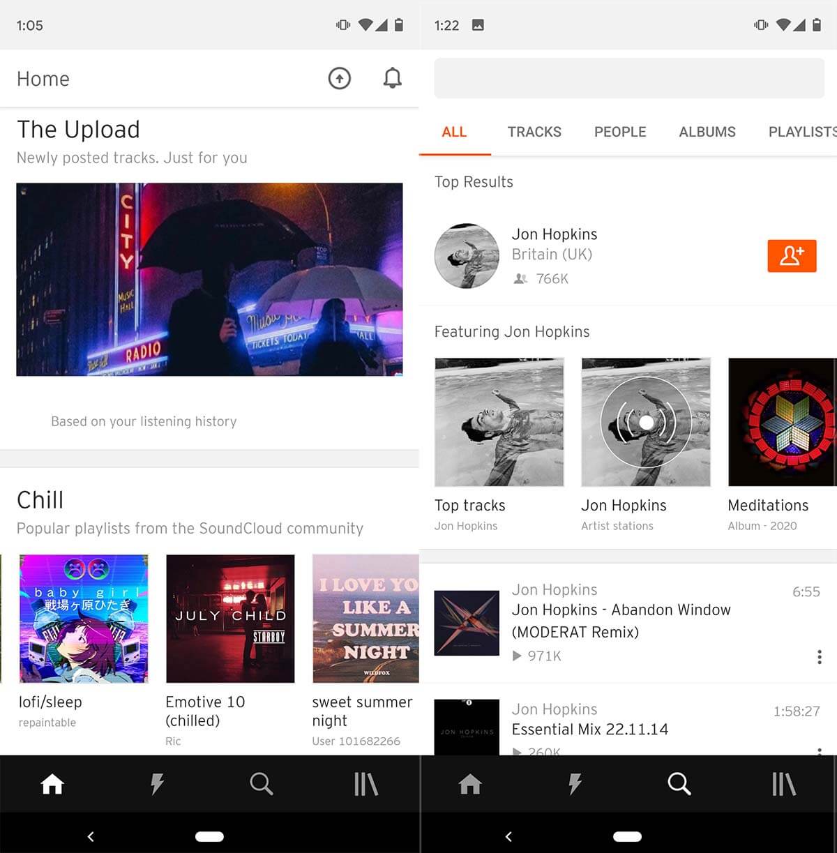
This case study demonstrates the power of regular usability testing in products with frequent updates.
Source: SoundCloud case study (.pdf) by test IO
Example #4: AutoTrader.com
AutoTrader.com is one of the world’s largest online marketplaces for buying and selling used cars, with over 28 million monthly visitors. The mission of AutoTrader’s website is to empower car shoppers in the researching process by giving them all the tools necessary to make informed decisions about vehicle purchases.
Sounds fantastic.
However, with competitors such as CarGurus gaining increasing amounts of market share in the online car shopping industry, AutoTrader had to do reinvent itself to stay competitive.
In e-commerce, competitors with a superior website can gain massive followings in an instant. Fifty years ago this was not the case – well-established car marketplaces had massive car parks all over the country, and a newcomer would have little in ways to compete.
Nowadays, however, it’s all about user experience. Digital shoppers will flock to whichever site offers a better user experience. Websites unwilling or unable to improve their user experience over time will get left in the dust. No matter how big or small they are.
Going back to AutoTrader, the majority of its website traffic comes from organic Google search, meaning that in addition to website usability, search engine optimization (SEO) is a major priority for the company. According to John Muller from Google, changing the layout of a website can affect rankings, and that is why AutoTrader had to be careful with making any large-scale changes to their website.
AutoTrader did not have a large team of user researchers nor a massive budget dedicated to usability testing. But they did have Bradley Miller – Senior User Experience Researcher at the company. To test the usability of AutoTrader, Miller decided to partner with UserTesting.com to conduct live user interviews with AutoTrader users.
Through these live user interviews, Miller was able to:
- Find and connect with target personas;
- Communicate with car buyers from across the country;
- Reduce the costs of conducting usability tests while increasing the insights gained.
From these remote usability live interviews, Miller learned that the customer journey almost always begins from a single source: search engines. Here, it’s important to note that search engines rarely direct users to the homepage. Instead, they drive traffic to the inner pages of websites. In the case of AutoTrader, for example, only around 20% of search engine traffic goes to the homepage (data from SEMrush).
These insights helped AutoTrader redesign their inner pages to better match the customer journey. They no longer assumed that any inner page visitor already has a greater contextual knowledge of the website. Instead, they started to treat each page as if it’s the initial point of entry by providing more contextual information right then and there inside the inner page.
This usability testing example demonstrates not only the power of user interviews but also the importance of understanding your customer journey and SEO.
Source: AutoTrader case study by UserTesting.com
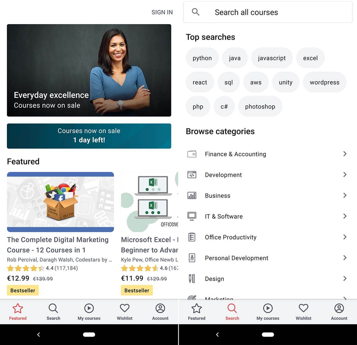
Example #5: Udemy
Udemy is one of the world’s largest online learning platforms with over 40 million students across the world. The e-learning giant also has a massively popular smartphone app, and the usability testing example in question was aimed at the smartphone users of Udemy.
To find out when, where, and why Udemy users chose to opt for the mobile app rather than the desktop version, Udemy conducted user tests. As Udemy is a 100% digital company, they chose fully remote unmoderated user testing as their testing method.
Test participants were asked to take small videos showing where they were located and what tasks they were focused on at the time of learning and recording.
What the user researchers found was that their initial theory of “users prefer using the mobile app while on the go” was false. Instead, what they found was that the majority of mobile app users were stationary. Udemy users, for various reasons, used the mobile app at home on the couch, or in a cafeteria. The key findings of this user test were utilized for the next year’s product and feature development.
This is what Udemy’s mobile app looks like today:
This usability testing case study demonstrates that a company’s perception of target audience behavior does not always match the behavior of the real end-users. And, that is why user testing is crucial.
Source: Udemy case study by UserTesting.com
Example #6: Halo: Combat Evolved
“Halo: Combat Evolved” was the first video game in the massively popular Halo franchise. It was developed by Bungie and published by Microsoft Game Studios in 2001. Within 10 years after its’ release, the Halo games sold more than 46 million copies worldwide and generated Microsoft more than $5 billion in video game and hardware sales. Owing it all to the usability test we’re about to discuss may be a bit of stretch, but usability testing the game during development was undeniably one of the factors that helped the franchise take off like a rocket.
In this usability study, the Halo team gathered a focus group of console gamers to try out their game’s prototype to see if they had fun playing the game. And, if they did not have fun – they wanted to find out what prevented them from doing so.
In the usability sessions, the researchers placed test subjects (players) in a large outdoor environment with enemies waiting for them across the open space.
The designers of the game expected the players to sprint closer towards the enemies, sparking a massive battle full of action and excitement. But, the test participants had a different plan in mind. Instead of putting themselves in danger by springing closer, they would stay at a maximum distance from the enemies and shoot from far across the outdoor space. While this was a safe and effective strategy, it proved to be rather uneventful and boring for the players.
To entice players to enjoy combat up close, the user researchers decided that changes would have to be made. Their solution – changing the size and color of the aiming indicator in the center of the screen to notify players when they were too far away from enemies.
Here, you can see the finalized aiming indicator in action:

Subsequent usability tests proved these changes to be effective, as the majority of user testers now engaged in combat from a closer distance.
User testing is not restricted to any particular industry, OS, or platform. Testing user experience is an invaluable tool for any product – not just for websites or mobile apps.
This example of usability testing from the video game industry shows that players (users) will optimize the fun out of a game if given the chance. It’s up to the designers to bring the fun back through well-designed game mechanics and notifications.
Source: “Designing for Fun – User-Testing Case Studies” by Randy J. Pagulayan